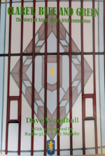
collapse collapse

Please donate to help towards the costs of keeping this site going. Thank You.

Recent Topics

Site Slow? by Drummond
[Today at 11:28:30 PM]


Transfer Window Summer 2025. The Verdict. by Drummond
[Today at 11:24:48 PM]


Europa League 2025-26 by Meanwood Villa
[Today at 10:15:36 PM]


Everton v Aston Villa Pre Match by paul_e
[Today at 10:02:44 PM]


Villa Park Redevelopment by VILLA MOLE
[Today at 09:01:47 PM]


Kits 25/26 by Clampy
[Today at 08:58:51 PM]


The men we couldn’t do without – Dwight Yorke by RamboandBruno
[Today at 08:37:25 PM]


Emi Martinez by kippaxvilla2
[Today at 08:17:18 PM]

Recent Posts

Re: Site Slow? by Drummond
[Today at 11:28:30 PM]


Re: Transfer Window Summer 2025. The Verdict. by Drummond
[Today at 11:24:48 PM]


Re: Europa League 2025-26 by Meanwood Villa
[Today at 10:15:36 PM]


Re: Europa League 2025-26 by Meanwood Villa
[Today at 10:14:53 PM]


Re: Everton v Aston Villa Pre Match by paul_e
[Today at 10:02:44 PM]


Re: Europa League 2025-26 by cdbearsfan
[Today at 09:49:25 PM]


Re: Europa League 2025-26 by PeterWithesShin
[Today at 09:47:00 PM]


Re: Transfer Window Summer 2025. The Verdict. by Beard82
[Today at 09:39:06 PM]

Follow us on...

Author Topic: Crest Review  (Read 443463 times)

Offline Bad English

  • Member
  • Posts: 45481
  • Age: 151
  • Location: Pyrénées Catalanes, France
  • I am Perpignan Villa
  • GM : 29.03.2025
Re: Crest Review
« Reply #3810 on: May 12, 2024, 01:36:20 PM »
*Aston Villa, that's who!🎵

Online Drummond

  • Member
  • *
  • Posts: 33234
  • Location: Everywhere, and nowhere.
  • GM : 11.10.2025
Re: Crest Review
« Reply #3811 on: May 12, 2024, 01:41:14 PM »
It's growing on me. The lion is ace. The star less so.

Offline Simon Page

  • Member
  • Posts: 5478
Re: Crest Review
« Reply #3812 on: May 12, 2024, 01:45:06 PM »
It's okay. As long as it isn't huge on the nipple, like the acreage of a dictator's medals, it'll be inoffensive. Think I'm with Perce on the improvements.

Cheers for posting.

Offline pauliewalnuts

  • Member
  • Posts: 74846
  • GM : 28.08.2025
Re: Crest Review
« Reply #3813 on: May 12, 2024, 01:50:15 PM »
The lion looks worse than the current one. All that over fussy embossed look. If one of the criticisms of the new round badge was it didn’t work on digital, that one looks like it would work even less to me.

Offline john2710

  • Member
  • Posts: 3116
  • Location: Hall Green
Re: Crest Review
« Reply #3814 on: May 12, 2024, 01:54:33 PM »
The thing with trying to introduce a new crest you'll never get a consensus. Personally I like the round badge, but the lions facing the wrong way. No matter how many times I look the current badge, the lion is still wrong.  But I can live with it.  But the star is just wrong & the sort of thing lesser clubs do because they know they'll never achieve that status again. I think it's small-time, others will think it's an appropriate nod to our greatest time.

Some will want prepared, some will want just a lion, some will argue it's the wrong shade of claret, we must have the star, it's Aston Villa FC, not Aston Villa or AVFC and 1874.

Maybe it's all cosmetic or maybe it's fundamental to our identity?

Offline Demitri_C

  • Member
  • Posts: 12432
Re: Crest Review
« Reply #3815 on: May 12, 2024, 01:56:30 PM »
It’s better than the wrong way facing Lion one.

Exactly thats the most unlikeable aspect.of  any designs to date

Offline Simon Page

  • Member
  • Posts: 5478
Re: Crest Review
« Reply #3816 on: May 12, 2024, 02:01:10 PM »
My issue with the star is I've never seen it placed somewhere it fits. It always looks like a clumsy add-on. I assume it's there as a result of us going from "don't mention 1982" to "proud history" and therefore mentioning Rotterdam in every other sentence. It just doesn't really have a natural place on any traditional-ish Villa badge.

When do we storm Heck's London office?

Offline Des Little

  • Member
  • Posts: 12867
  • Location: A5 Ultra
  • GM : 03.05.2021
Re: Crest Review
« Reply #3817 on: May 12, 2024, 02:32:50 PM »
If we must have a star, why don’t we just do the same as the England kit, have one embroidered above the badge in the same colour of the shirt, so it’s subtle and leaves the badge clutter free.

Offline Percy McCarthy

  • Member
  • Posts: 35838
  • Location: I'm hiding in my hole
    • King City Online
Re: Crest Review
« Reply #3818 on: May 12, 2024, 02:41:11 PM »
If we must have a star, why don’t we just do the same as the England kit, have one embroidered above the badge in the same colour of the shirt, so it’s subtle and leaves the badge clutter free.

Agreed. If we must.

Offline KRS

  • Member
  • Posts: 7027
Re: Crest Review
« Reply #3819 on: May 12, 2024, 02:44:48 PM »
If we must have a star, why don’t we just do the same as the England kit, have one embroidered above the badge in the same colour of the shirt, so it’s subtle and leaves the badge clutter free.
Because someone had a brain fart and it’s still lingering in the air like dense curry fog that has you questioning whether or not you’ve just soiled yourself or got away with it.

Offline edgysatsuma89

  • Member
  • Posts: 6581
Re: Crest Review
« Reply #3820 on: May 12, 2024, 02:45:19 PM »
If we must have a star, why don’t we just do the same as the England kit, have one embroidered above the badge in the same colour of the shirt, so it’s subtle and leaves the badge clutter free.

Agreed. If we must.

It's so painfully logical that that should happen.

Offline jon collett

  • Member
  • Posts: 1044
Re: Crest Review
« Reply #3821 on: May 12, 2024, 02:56:41 PM »
If we must have a star, why don’t we just do the same as the England kit, have one embroidered above the badge in the same colour of the shirt, so it’s subtle and leaves the badge clutter free.

Agreed. If we must.

It's so painfully logical that that should happen.


From memory somebody probably Premier League said that wasn’t allowed in the first place and we thought we could get round it by including it inside the badge.

I still don’t see why we need it. I’d much rather “Prepared” was added!

Offline pablo_picasso

  • Member
  • Posts: 3776
  • GM : 17.11.2024
Re: Crest Review
« Reply #3822 on: May 12, 2024, 03:10:11 PM »
If we must have a star, why don’t we just do the same as the England kit, have one embroidered above the badge in the same colour of the shirt, so it’s subtle and leaves the badge clutter free.

Agreed. If we must.

It's so painfully logical that that should happen.


From memory somebody probably Premier League said that wasn’t allowed in the first place and we thought we could get round it by including it inside the badge.

I still don’t see why we need it. I’d much rather “Prepared” was added!

Forest manage to get their two above theirs.

Offline edgysatsuma89

  • Member
  • Posts: 6581
Re: Crest Review
« Reply #3823 on: May 12, 2024, 03:12:40 PM »
Isn't it what Forest do? Or is that because it doesn't have a border? I would just have it above the badge for any European games.

Offline jon collett

  • Member
  • Posts: 1044
Re: Crest Review
« Reply #3824 on: May 12, 2024, 03:12:46 PM »
If we must have a star, why don’t we just do the same as the England kit, have one embroidered above the badge in the same colour of the shirt, so it’s subtle and leaves the badge clutter free.

Agreed. If we must.

It's so painfully logical that that should happen.


From memory somebody probably Premier League said that wasn’t allowed in the first place and we thought we could get round it by including it inside the badge.

I still don’t see why we need it. I’d much rather “Prepared” was added!

Forest manage to get their two above theirs.

Yep but they don’t have a shield so perhaps technically inside the crest?


SimplePortal 2.3.6 © 2008-2014, SimplePortal