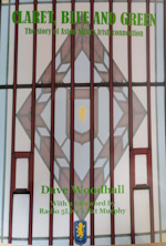
collapse collapse

Please donate to help towards the costs of keeping this site going. Thank You.

Recent Topics

Villa Park Redevelopment by Chico Hamilton III
[Today at 09:24:14 AM]


FFP by Chico Hamilton III
[Today at 09:14:08 AM]


Aston Villa v Wolverhampton Wanderers Pre Match by dicedlam
[Today at 09:14:03 AM]


Gordon Cowans by PeterWithesShin
[Today at 08:56:31 AM]


All aboard the shuttle bus. by algy
[Today at 08:04:45 AM]


Other Games - 2023/24 by Dogtanian
[Today at 07:10:41 AM]


Please Donate to Keep This Site Going - Link on Left & Top of Page by Bad English
[Today at 06:57:08 AM]


Muppet Donations by Bad English
[Today at 06:56:08 AM]

Recent Posts

Follow us on...

Author Topic: Crest Review  (Read 269653 times)

Online London Villan

  • Member
  • Posts: 9514
  • Location: Brum
  • GM : 27.05.2019
Re: Crest Review
« Reply #480 on: September 13, 2022, 04:32:46 PM »
As someone in the marketing world there is no-way you can communicate all of what he is trying to do through a logo.

The logo is almost the cherry on the top of cake - all that stuff about hard work, togetherness and fearlessness comes through everything else you do, from how you are on pitch, to how you treat your fans. If you are really clever there will be some links between the playing side and the fans in terms of values, but that can end up being an exercise in post-rationalising meanings.

Elements...

Lion (I think this is the trickiest part to get right)
Colours (Claret and blue - no yellow/gold as it doesn't translate well to screen)
Wording (Aston Villa)
Device (shield, circle etc)

Should be easy! But whatever happens, people will hate it.


Offline chrisw1

  • Member
  • *
  • Posts: 9147
  • GM : 20.08.2024
Re: Crest Review
« Reply #481 on: September 13, 2022, 04:36:27 PM »
That’s very true Chris. Overthinking it and trying to incorporate historic elements of the club could easily make it overly fussy regardless of the story. A clean modern minimalist design is what I would like to see…subtle nods to the “story” can be included but if they complicate or take away from the design then they should end up in the recycling bin.
Same.  My personal favourite would be a stand alone lion on the shirt - in the same way Liverpool and Spurs do, but I'm pretty open minded to something more traditional.

Offline Risso

  • Member
  • *
  • Posts: 84837
  • Location: Leics
  • GM : 04.03.2025
Re: Crest Review
« Reply #482 on: September 13, 2022, 09:17:39 PM »


Absolutely love this video. The idea of storytelling was a powerful way of focusing creative juices aimed at producing something fit for purpose, unique that screams Aston Villa. The issue isn't about whether you like the design he came up with it is about the process. If the villa creatives follow the same path I'm sure will have a great logo


Of all the fan designs I've seen in recent times, that's the worst by a long, long way. Dreadful.

Offline Toronto Villa

  • Member
  • *
  • Posts: 53925
  • Age: 51
  • Location: Toronto, Canada
  • GM : 22.07.2024
Re: Crest Review
« Reply #483 on: September 13, 2022, 09:18:30 PM »
That really is utter, utter shit

Offline eamonn

  • Member
  • Posts: 29739
  • Location: Down to Worthing...and work there
  • GM : 26.07.2020
Re: Crest Review
« Reply #484 on: September 13, 2022, 09:27:41 PM »
Article by Gregg in The Athletic. Bits in bold made me chuckle, good to see the chap put a bit of humour into his articles even if inadvertently.


Quote
Aston Villa’s badge: Lion stays, but ‘AVFC’ could be replaced in redesign
Gregg Evans
Sep 13, 2022

What is a badge in any case? It’s a complicated question to answer.

Perhaps your football club’s most ubiquitous symbol is a storied, heraldic design harking back to the local coat of arms or a sleek, modern design dreamt up to look effortlessly slick emblazoned on modern sportswear.

But why is there a tree? Or a bee? Or a devil? Is that an… elephant?

This week, The Athletic is breaking down the details hiding in plain sight and explaining what makes your club badge.

In the commercial department at Aston Villa, the early stages of a significant change are already underway.

For the first time since 2016, alterations will be made to the club’s badge as part of a shake-up to “review how we present ourselves visually in the future”.

As with everything central to the history of a founding-member football club — the name, colours, stadium and crest — supporters take great pride in maintaining tradition and authenticity.

Villa understand that and continue to engage deeply with their fanbase.

On the official website, a section has been created for supporters to leave views and suggestions for how the crest should look.

“True claret and blue Villans” will also be contacted for their thoughts and conversations will take place during sessions with the Fans Consultation Group.

Ultimately, though, the final design for the new look will be decided by club officials and there will be no poll or development updates.

The badge rollout will then tie in with the North Stand expansion at Villa Park.

These are progressive times for Villa and the club want to maximise every opportunity.

Altering the badge is significant but nothing new. There have been multiple new designs over the years and at this early stage — the aim is to have it ready for next season — there’s no clarity on what exactly about the current one will be tweaked, although the explanation that “this isn’t a process of starting from scratch” suggests there isn’t the desire for major surgery.

A key element of the Villa crest is the lion.

It is a tribute to the Royal Arms of Scotland and the Scottish heritage of Birmingham.

In 1877, the new club’s chairman was William McGregor, a Scotsman who had been attracted to Villa because of the links to his homeland. It was McGregor who decided that Scotland’s royal crest should be the emblem of an English club 200 miles from the border between the two nations.

McGregor also founded England’s top division in 1888 and carried through reform on a national level. It was his drive and direction that helped turn football into a professional sport.

Initially, the lion on Villa’s crest faced in the opposite direction to today’s version. And it was red, like the one on the Royal Arms of Scotland, not yellow.

There was also a period where it wasn’t on the badge at all before it returned in time for Villa’s FA Cup final win in 1957. Since then it has always existed as part of the crest in different forms.

In 2007, the lion was made “proud, looking to the future and unified — signalling our desire for togetherness”.

There have also been tweaks over the years to make the lion more ferocious-looking. Claws were added during the last rebrand, to give a more powerful look.

Assuming the lion retains his place on the new crest, much of the other focus will centre around the colour scheme, wording and the overall shape.

For a club who play in claret and blue at home, and have claret and blue seats inside their stadium, there’s a lot of yellow — the lion himself is yellow — on the current badge. Finding the right colour balance is one area club officials are looking at.

Deciding whether to remove the “AVFC” and revert to using “Aston Villa” is another consideration.

Villa want to be mixing with the big boys in the division, and what do Manchester City, Liverpool, Manchester United, Arsenal, Tottenham and Chelsea all have in common? They’ve got the full name of the club on the badge.

In fact, Villa are one of only five Premier League clubs NOT to use the full name.

Nottingham Forest, Fulham and Leeds United use abbreviations to display their identity, while Wolverhampton Wanderers simply have a wolf’s head with no lettering or words.

In 2007, it was decided that “AVFC” would be a better way to represent the club on the crest but times have changed and the use of social media is far more important now. Villa see the crest changes as necessary if they are to stand out as a global brand.

Admittedly, the crest hasn’t changed too much in recent years.

As part of that rebrand 15 years ago, a white star was added to mark the club’s 1982 European Cup final victory. No doubt that will remain on the next version.

Then, in 2016, there was the decision to remove the word “Prepared” — a long-term feature — which was ironic as the club had just suffered relegation, looking deeply unprepared as they finished bottom with only three wins in their 38 Premier League matches.

Apart from that, Villa’s crest has had a similar look for some time even though most older supporters liked the round badge worn from 1973 to 1992, which is synonymous with both the club’s last league title in 1980-81 and the following season’s European Cup triumph.

The plan next is to “inspire for the future”.


Offline Des Little

  • Member
  • Posts: 12428
  • Location: A5 Ultra
  • GM : 03.05.2021
Re: Crest Review
« Reply #485 on: September 13, 2022, 10:03:30 PM »
I do hope he’s wrong about keeping the star.

Online Sexual Ealing

  • Member
  • *
  • Posts: 18866
  • Location: Bulgaria
  • GM : PCM
Re: Crest Review
« Reply #486 on: September 13, 2022, 10:24:34 PM »


Absolutely love this video. The idea of storytelling was a powerful way of focusing creative juices aimed at producing something fit for purpose, unique that screams Aston Villa. The issue isn't about whether you like the design he came up with it is about the process. If the villa creatives follow the same path I'm sure will have a great logo


Of all the fan designs I've seen in recent times, that's the worst by a long, long way. Dreadful.

I write corporate marketing bollocks for a living, and I found that a tough watch. I normally like his stuff but I feel like I've just been fisted by Ayn Rand. And she was holding a twelve-sided star. I'm actually motivated to do the work I've been avoiding all day now, because it can't possibly be more tedious than that.

Offline eamonn

  • Member
  • Posts: 29739
  • Location: Down to Worthing...and work there
  • GM : 26.07.2020
Re: Crest Review
« Reply #487 on: September 13, 2022, 10:36:45 PM »
I hope our Canadian friend hasn't screwed the pooch on this one. He's been great entertainment with good Villa insight up to now.

Offline AV82EC

  • Member
  • Posts: 10235
  • Location: Macclesfield
  • GM : 22.02.2024
Re: Crest Review
« Reply #488 on: September 13, 2022, 10:38:11 PM »


Absolutely love this video. The idea of storytelling was a powerful way of focusing creative juices aimed at producing something fit for purpose, unique that screams Aston Villa. The issue isn't about whether you like the design he came up with it is about the process. If the villa creatives follow the same path I'm sure will have a great logo


Of all the fan designs I've seen in recent times, that's the worst by a long, long way. Dreadful.

I write corporate marketing bollocks for a living, and I found that a tough watch. I normally like his stuff but I feel like I've just been fisted by Ayn Rand. And she was holding a twelve-sided star. I'm actually motivated to do the work I've been avoiding all day now, because it can't possibly be more tedious than that.

I’ll put you down as undecided SE.

(fuck me the badge was a complete catastrofuck and the only surprise was not hearing the words “thought shower”. Jesus Fucking Christ.)

Online LeeB

  • Member
  • Posts: 31141
  • Location: Standing in the Klix-O-Gum queue.
  • GM : May, 2014
Re: Crest Review
« Reply #489 on: September 14, 2022, 10:11:46 AM »


Absolutely love this video. The idea of storytelling was a powerful way of focusing creative juices aimed at producing something fit for purpose, unique that screams Aston Villa. The issue isn't about whether you like the design he came up with it is about the process. If the villa creatives follow the same path I'm sure will have a great logo


Of all the fan designs I've seen in recent times, that's the worst by a long, long way. Dreadful.

I write corporate marketing bollocks for a living, and I found that a tough watch. I normally like his stuff but I feel like I've just been fisted by Ayn Rand. And she was holding a twelve-sided star. I'm actually motivated to do the work I've been avoiding all day now, because it can't possibly be more tedious than that.

I'm sure you've used that simile before, it's either a recurring nightmare or a niche interest. I skipped to the end after listening to his life changing marketing experience and he appeared to be suggesting some kind of sheriff's badge.

I find myself concerned that the process itself will eventually spit out something as hideous.

Online Sexual Ealing

  • Member
  • *
  • Posts: 18866
  • Location: Bulgaria
  • GM : PCM
Re: Crest Review
« Reply #490 on: September 14, 2022, 10:30:27 AM »
I have. I think it was after a bruising encounter with Ads. No fisting took place. Not that I remember, anyway.

Offline AV82EC

  • Member
  • Posts: 10235
  • Location: Macclesfield
  • GM : 22.02.2024
Re: Crest Review
« Reply #491 on: September 14, 2022, 10:35:09 AM »


Absolutely love this video. The idea of storytelling was a powerful way of focusing creative juices aimed at producing something fit for purpose, unique that screams Aston Villa. The issue isn't about whether you like the design he came up with it is about the process. If the villa creatives follow the same path I'm sure will have a great logo


Of all the fan designs I've seen in recent times, that's the worst by a long, long way. Dreadful.

I write corporate marketing bollocks for a living, and I found that a tough watch. I normally like his stuff but I feel like I've just been fisted by Ayn Rand. And she was holding a twelve-sided star. I'm actually motivated to do the work I've been avoiding all day now, because it can't possibly be more tedious than that.

I'm sure you've used that simile before, it's either a recurring nightmare or a niche interest. I skipped to the end after listening to his life changing marketing experience and he appeared to be suggesting some kind of sheriff's badge.

I find myself concerned that the process itself will eventually spit out something as hideous.

A Sheriffs Badge! I wa starting to think what the hideous monstrosity reminded me of and you are right. I think the Viz definition of a sheriffs badge totally sums up the end result.

Online LeeB

  • Member
  • Posts: 31141
  • Location: Standing in the Klix-O-Gum queue.
  • GM : May, 2014
Re: Crest Review
« Reply #492 on: September 14, 2022, 10:45:59 AM »
Yes, maybe we could use the chocolate colour we wore back in the day to finish it.

Online Villan82

  • Member
  • Posts: 3218
Re: Crest Review
« Reply #493 on: September 14, 2022, 11:45:46 AM »
Nothing anybody produces will please everybody.

Ditto the new Witton End.

Offline eamonn

  • Member
  • Posts: 29739
  • Location: Down to Worthing...and work there
  • GM : 26.07.2020
Re: Crest Review
« Reply #494 on: September 14, 2022, 04:25:52 PM »
Yes, but not only has he omitted our full name but the AV is too subtle to catch to the untrained eye, as well.


SimplePortal 2.3.6 © 2008-2014, SimplePortal