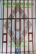
collapse collapse

Please donate to help towards the costs of keeping this site going. Thank You.

Recent Topics

Site Slow? by Drummond
[Today at 11:28:30 PM]


Transfer Window Summer 2025. The Verdict. by Drummond
[Today at 11:24:48 PM]


Europa League 2025-26 by Meanwood Villa
[Today at 10:15:36 PM]


Everton v Aston Villa Pre Match by paul_e
[Today at 10:02:44 PM]


Villa Park Redevelopment by VILLA MOLE
[Today at 09:01:47 PM]


Kits 25/26 by Clampy
[Today at 08:58:51 PM]


The men we couldn’t do without – Dwight Yorke by RamboandBruno
[Today at 08:37:25 PM]


Emi Martinez by kippaxvilla2
[Today at 08:17:18 PM]

Recent Posts

Re: Site Slow? by Drummond
[Today at 11:28:30 PM]


Re: Transfer Window Summer 2025. The Verdict. by Drummond
[Today at 11:24:48 PM]


Re: Europa League 2025-26 by Meanwood Villa
[Today at 10:15:36 PM]


Re: Europa League 2025-26 by Meanwood Villa
[Today at 10:14:53 PM]


Re: Everton v Aston Villa Pre Match by paul_e
[Today at 10:02:44 PM]


Re: Europa League 2025-26 by cdbearsfan
[Today at 09:49:25 PM]


Re: Europa League 2025-26 by PeterWithesShin
[Today at 09:47:00 PM]


Re: Transfer Window Summer 2025. The Verdict. by Beard82
[Today at 09:39:06 PM]

Follow us on...

Author Topic: Crest Review  (Read 443466 times)

Offline Olneythelonely

  • Member
  • *
  • Posts: 8961
  • Location: Selly Park
  • GM : 13.06.26
Re: Crest Review
« Reply #4065 on: June 01, 2024, 10:38:10 AM »
Looks ok to me.
It just a thumbnail at the top of a webpage.
Nothing at all to be ‘embarrassed’ about.

If it was a design project at school, it would be marked down heavily for lack of consideration of how it would look when shrunk to a smaller size.

I’m not saying it brings shame to the club or anything like that, but if this was created by a designer, it’s not something you’d be proud of. Have a look at it compared to other logos on your phone screen. Find one that looks shitter.

Obviously not telling you to care. But it’s a fair assumption that this is the topic for those that do.


Offline Risso

  • Member
  • Posts: 89939
  • Location: Leics
  • GM : 04.03.2025
Re: Crest Review
« Reply #4066 on: June 01, 2024, 11:41:50 AM »
BUZZZZZZZZZZZZZZZZZZZZZZZZZ

Paulie already mentioned them Risso.


Yeah, I saw, I just meant in terms of posting the video.

Offline Bad English

  • Member
  • Posts: 45481
  • Age: 151
  • Location: Pyrénées Catalanes, France
  • I am Perpignan Villa
  • GM : 29.03.2025
Re: Crest Review
« Reply #4067 on: June 01, 2024, 11:50:39 AM »
I just opened the Pravda app and it said an update was pending. I installed it and it is still the same old shit badge and not the new shit one.

Offline Archbishop Herbert Cockthrottle

  • Member
  • *
  • Posts: 27414
  • Location: Couché dans le caniveau en regardant les étoiles.
  • GM : 30.08.2026
Re: Crest Review
« Reply #4068 on: June 01, 2024, 11:52:55 AM »
Am I alone in 'quite' liking it?

Offline Bad English

  • Member
  • Posts: 45481
  • Age: 151
  • Location: Pyrénées Catalanes, France
  • I am Perpignan Villa
  • GM : 29.03.2025
Re: Crest Review
« Reply #4069 on: June 01, 2024, 12:16:40 PM »
Scrub that, there was a second update with the new shit badge.

Online john e

  • Member
  • *
  • Posts: 20626
  • GM : 28.06.2024
Re: Crest Review
« Reply #4070 on: June 01, 2024, 01:07:44 PM »
It’s better than the Learner one simply because it has Aston Villa written on it

What’s the point in having the greatest name in world football and not using it
Just ask Tom Hanks

Offline KRS

  • Member
  • Posts: 7027
Re: Crest Review
« Reply #4071 on: June 01, 2024, 01:20:31 PM »
Think we’ll see the kits very soon
The Adidas deal starts today so was expecting the announcement today considering how they’ve been pushing out all the promotion…so may be it’ll be Monday instead.

Offline PeterWithesShin

  • Member
  • Posts: 76396
  • GM : 17.03.2015
Re: Crest Review
« Reply #4072 on: June 01, 2024, 01:54:19 PM »
As a decent sized image it looks ok imo, as a thumbnail or smaller profile pic it doesn't. The yellow of the lion seems to distort it and you can't see the 1874.

Offline tomd2103

  • Member
  • Posts: 15479
Re: Crest Review
« Reply #4073 on: June 01, 2024, 02:27:32 PM »
As a decent sized image it looks ok imo, as a thumbnail or smaller profile pic it doesn't. The yellow of the lion seems to distort it and you can't see the 1874.

Still don't like it, but it's done now and there are more important things to focus on over the coming months.

Online paul_e

  • Member
  • Posts: 37440
  • Age: 45
  • GM : July, 2013
Re: Crest Review
« Reply #4074 on: June 01, 2024, 02:36:55 PM »
As a decent sized image it looks ok imo, as a thumbnail or smaller profile pic it doesn't. The yellow of the lion seems to distort it and you can't see the 1874.

Same, it's the only thing I really dislike about it and I find it surprising it's been done when everyone knows how common thumbnail size images are.

Offline FatSam

  • Member
  • Posts: 1476
Re: Crest Review
« Reply #4075 on: June 01, 2024, 05:35:02 PM »
I didn’t have a strong opinion about whether the new crest should have been round or a shield, or even the silhouette of a lion, but I wanted it to say ‘Aston Villa’ rather than ‘AVFC’, have the Lion facing the right way, and ideally not have the star. However, I appreciate the difficulty in reaching a consensus from consultation with a broad group of people, such as a football club fanbase. For this reason, none of these preferences were deal breakers for me provided that the new crest was a bold, ambitious, and competent piece of graphic design. The fact that some basic principles of graphic design haven’t been adhered to suggests that the brief was too prescriptive; the Lerner crest seems to have been given too much respect, when we all know that it was a bodge job. The fact that the text is too small, and crammed down at the bottom, is part of the reason why it doesn’t scale well as a thumbnail. It obviously is what it is, and some football clubs have crap crests - I just didn’t want Aston Villa to be one of them.

Offline Astnor

  • Member
  • Posts: 1206
  • Age: 60
  • Location: Up North
Re: Crest Review
« Reply #4076 on: June 01, 2024, 07:31:34 PM »
It s grown on me. I like that its a shield form, blue background and claret for aston villa and around the shield. I have had to use time about the yellow Lion but cant see now how it could be different given the shield background. The shadow thing they could have left out but I think it s about the real badges that you put on clothes the lion will stand out (thicker clothes- stuff than rest of it) thats way shadow on flat pictures. Also it has a more up to date feel than the round one from the seventies / eighties that I like much. Everything probably said here before and I m certainly not a pro on these matters but did like to put my view out here - its a positive for me along all the other positives with the club now.

Offline pauliewalnuts

  • Member
  • Posts: 74846
  • GM : 28.08.2025
Re: Crest Review
« Reply #4077 on: June 01, 2024, 08:20:45 PM »
I don't know if it is because i was focused on how shit the new badge looks on the site (ironic, given that the whole argument against the old new one was that it looked bad on digital) but it appears it's an actual new site.

Offline pauliewalnuts

  • Member
  • Posts: 74846
  • GM : 28.08.2025
Re: Crest Review
« Reply #4078 on: June 01, 2024, 08:21:22 PM »
.... until you go to the tickets section, and there it is with the old old badge, the one prior to the round one.

Offline exigo

  • Member
  • Posts: 2857
Re: Crest Review
« Reply #4079 on: June 02, 2024, 09:50:33 PM »
Our new font is called Medula One if anyone else fancies hours of fun.


SimplePortal 2.3.6 © 2008-2014, SimplePortal