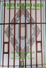
Quality looks bad. The shirt looks bad. Yes it ticks the boxes, but never a classic.
Quote from: robbo1874 on August 07, 2020, 10:50:40 AMQuality looks bad. The shirt looks bad. Yes it ticks the boxes, but never a classic.What are you basing your conclusion on that the quality looks bad? It clearly doesn't look bad on the released photos so are you just assuming based on last year?
Quote from: chrisw1 on August 07, 2020, 10:52:55 AMQuote from: robbo1874 on August 07, 2020, 10:50:40 AMQuality looks bad. The shirt looks bad. Yes it ticks the boxes, but never a classic.What are you basing your conclusion on that the quality looks bad? It clearly doesn't look bad on the released photos so are you just assuming based on last year? I am. All I know is that my kits were terribly made last year, and my mate who is a Leeds fan, his Kappa kit was just as bad. I've got kits from 25 years ago that are in better nick than last year's.
Mine arrived this morning.Have to say, looks like Kappa have taken on board some of the criticism of last year's kit. The claret has a touch more blue in the mix than last year, so it's less brick red and more what I would call 'proper' claret. And the blue sleeves are a touch stronger in colour – still a little light for me, but a better combination of our classic colours.The rubber badge is decent – the lion is a strong pressing of the new woodcut version, which has picked up all the detail. I'd criticise the framing of the AVFC, which is too tight to the white frame. And the font is still Chelsea Studio, which is an absolute crime against humanity.The large seems a touch more generous, particularly in the neck. Can actually get my head through it without needing a team of assistants on standby.
Quote from: exigo on August 08, 2020, 12:50:36 PMMine arrived this morning.Have to say, looks like Kappa have taken on board some of the criticism of last year's kit. The claret has a touch more blue in the mix than last year, so it's less brick red and more what I would call 'proper' claret. And the blue sleeves are a touch stronger in colour – still a little light for me, but a better combination of our classic colours.The rubber badge is decent – the lion is a strong pressing of the new woodcut version, which has picked up all the detail. I'd criticise the framing of the AVFC, which is too tight to the white frame. And the font is still Chelsea Studio, which is an absolute crime against humanity.The large seems a touch more generous, particularly in the neck. Can actually get my head through it without needing a team of assistants on standby.Chelsea Studio? Still Stempel Garamond Bold I think. I forget the Prepared isn’t on the badge anymore, what was the ?microsoft font that sent shudders? I was just curious if it had been removed everywhere:Quick google brought up this Dec 2019 20mins YouTube stadium tour, largely gone from my quick scrolling but saw it is still in the players lounge, but more interestingly some artefacts in there (at 11mims 40) I don’t remember seeing before like a tankard given by Bayern in 82.https://youtu.be/4YHoghgxkTg
My new kit arrived today. It's a really nice kit to be fair, and feels decent quality as well, although I'll reserve judgement on that until it's washed after I wear it tonight for 5 aside. The only slight criticism I'd have of it is design-wise that the badge is far too high up towards the shoulder. It looks really odd positioned like that.
Quote from: Risso on August 11, 2020, 05:24:53 PMMy new kit arrived today. It's a really nice kit to be fair, and feels decent quality as well, although I'll reserve judgement on that until it's washed after I wear it tonight for 5 aside. The only slight criticism I'd have of it is design-wise that the badge is far too high up towards the shoulder. It looks really odd positioned like that.I thought that about the badge but wondered if the blue coming across the top was making it seem a little higher than it was. Now you’ve seen it in the flesh, it does seem strange positioning.
Quote from: CT on August 11, 2020, 05:54:12 PMQuote from: Risso on August 11, 2020, 05:24:53 PMMy new kit arrived today. It's a really nice kit to be fair, and feels decent quality as well, although I'll reserve judgement on that until it's washed after I wear it tonight for 5 aside. The only slight criticism I'd have of it is design-wise that the badge is far too high up towards the shoulder. It looks really odd positioned like that.I thought that about the badge but wondered if the blue coming across the top was making it seem a little higher than it was. Now you’ve seen it in the flesh, it does seem strange positioning. There might have been a clause in the Sponsor's contract that the logo had to be in a certain place and of a certain size. Are there any other clubs with the same sponsor? might be worth looking to see where their badge is placed.