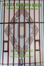
collapse collapse

Please donate to help towards the costs of keeping this site going. Thank You.

Follow us on...

Author Topic: Crest Review  (Read 280010 times)

Offline Drummond

  • Member
  • *
  • Posts: 28979
  • Age: 52
  • Location: My own little world.
  • GM : 10.10.2024
Re: Crest Review
« Reply #3360 on: January 08, 2024, 07:32:44 AM »
It’s horrible.

No offence, like.

Yeah, with you on this.

Yes, don’t like that. It reminds me of the pendants they used to swap before a match.
Pennants?

Jermaine thing is you knew what he meant.

Online Ian.

  • Member
  • *
  • Posts: 13941
  • Location: Back home in the Shire
  • GM : 07.10.2024
Re: Crest Review
« Reply #3361 on: January 08, 2024, 08:01:56 AM »
It’s horrible.

No offence, like.

Yeah, with you on this.

Yes, don’t like that. It reminds me of the pendants they used to swap before a match.
Pennants?

That’s the ones!

Offline Axl Rose

  • Member
  • Posts: 13907
  • Location: Tokyo
  • GM : 02.04.2022
Re: Crest Review
« Reply #3362 on: January 08, 2024, 08:15:36 AM »
It’s horrible.

No offence, like.

Yeah, with you on this.

Yes, don’t like that. It reminds me of the pendants they used to swap before a match.
Pennants?

Jermaine thing is you knew what he meant.

😂

Offline chrisw1

  • Member
  • *
  • Posts: 9287
  • GM : 20.08.2024
Re: Crest Review
« Reply #3363 on: January 08, 2024, 09:06:13 AM »
It’s horrible.

No offence, like.

Yeah, with you on this.

Yes, don’t like that. It reminds me of the pendants they used to swap before a match.
Pennants?
Pedants?

Online nigel

  • Member
  • Posts: 5385
Re: Crest Review
« Reply #3364 on: January 08, 2024, 09:10:20 AM »
As a child I remember receiving a birthday card with a plastic Aston Villa badge on the front. The old shield with claret and blue split diagonally in it with silver lion and trim, often wondered whether this could work today....apologises for my poor attempt, I'm a printer by trade,  i leave in design/photoshopping for the experts.


That would look really nice on a plain black or white top.
Our colours emphasised in the badge rather than the trim

Offline dave shelley

  • Member
  • *
  • Posts: 15476
  • Age: 75
  • Location: between a rock and a hard place
  • GM : 01.02.2025
Re: Crest Review
« Reply #3365 on: January 08, 2024, 09:13:49 AM »
IMO, it should be the badge worn on the shirt on the greatest night in our history, no question.

Offline Archbishop Herbert Cockthrottle

  • Member
  • *
  • Posts: 25414
  • Location: Couché dans le caniveau en regardant les étoiles.
  • GM : 06.07.2024
Re: Crest Review
« Reply #3366 on: January 08, 2024, 09:21:01 AM »
No name, no shield, just a lion rampant.

Offline django

  • Member
  • Posts: 2189
  • Location: Sparkbrook
Re: Crest Review
« Reply #3367 on: January 08, 2024, 09:51:17 AM »
The trademarked design looks amateurish and the aborted process of relaunching the round badge only to almost immediately relaunch another one is incompetent.

I can almost respect the opinion that the round badge is too similar to some other badges (so might impede the search for noodle partners in Malaysia etc) but if it’s worth cancelling the round one midway through it’s launch and the amateur vibe that gives off, you’d better get it right this time round.

To me the obvious eras to look towards are our successful ones. Early 80s, what I’d have gone for, obviously for whatever reason doesn’t float the boards boat. The more classic scalloped shield shapes of the 50s and earlier variants seem a bit wrong for a 2024 launch. I’d just keep the elements that we need, the name, the lion, sometimes the year depending on purpose. Sack off the shitty star. 2 colours, 1 font.

I dont like the Ellis stripy badge now that I think about it , I didn’t like the Lerner one. I didn’t understand the reversed lion on the newer round badge. All of them I got used to and thought about only when they were being changed. I’d like the club to settle on something one day but knowing our luck when we do it will be something with drop shadow and comic sans on it.

Offline Chris Harte

  • Member
  • Posts: 12196
Re: Crest Review
« Reply #3368 on: January 08, 2024, 10:13:32 AM »
After some consideration, I'd come round to the thought of the badge just being the lion (the 50s version, or 80s, or the one on the new round badge, I don't mind), with 18 to it's left and 74 to it's right. All in claret, no shield, no star, not even the name of the club. Let Unai make the badge as famous as the instantly recognisable badges of Real Madrid and Barcelona.

Then I thought all claret will clash with the kit, so it needs a.background after all.

Let it be round.

Offline Didier Five

  • Member
  • Posts: 70
Re: Crest Review
« Reply #3369 on: January 08, 2024, 10:21:50 AM »
For me it's just a badge and nothing to get worked up about, it's changed many times in the past and no doubt it will be changed again many times in the future.

Whatever badge the club come up with some will hate it and some will like it. If you don't like it don't worry because it will change again soon no doubt and you might like that one.

Online Ian.

  • Member
  • *
  • Posts: 13941
  • Location: Back home in the Shire
  • GM : 07.10.2024
Re: Crest Review
« Reply #3370 on: January 08, 2024, 10:47:40 AM »

Offline chrisw1

  • Member
  • *
  • Posts: 9287
  • GM : 20.08.2024
Re: Crest Review
« Reply #3371 on: January 08, 2024, 05:46:09 PM »
Amazing how much difference a change of colour can make.


Online pauliewalnuts

  • Member
  • *
  • Posts: 71362
  • GM : 26.08.2024
Re: Crest Review
« Reply #3372 on: January 08, 2024, 06:51:28 PM »
Amazing how much difference a change of colour can make.


Yep

Still horrible, only in a different colour scheme.

Offline Bad English

  • Member
  • *
  • Posts: 43597
  • Age: 150
  • Location: Pyrénées Orientales
  • I am Perpignan Villa
  • GM : 29.03.2025
Re: Crest Review
« Reply #3373 on: January 08, 2024, 07:26:44 PM »
Every day I wake up and the first thing I do is think of the badge fiasco, the 150 Chinese New Year logo, the trademarked MS Wordart Year 9 General Studies project 'AVFC' drop-shadowed abominations, and I scream "You amateur, bungling, irresponsible TWATS!"

FFS!

Offline gpbarr

  • Member
  • Posts: 1431
  • Location: New York City
  • GM : 31.03.2017
Re: Crest Review
« Reply #3374 on: January 08, 2024, 10:14:02 PM »
Who cares? We are 2nd in the PL, we have one of the world’s best managers, and we are and will always be the Villa.

 The badge is just a passing piece of marketing that will be forgotten in time


SimplePortal 2.3.6 © 2008-2014, SimplePortal