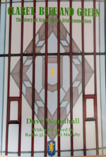
The claret on the home shirt may not be the right claret according to traditionalists but its a nice sharp colour. I think its more fashionable than the traditional colour. The shirt is really good quality, nice thin, light material. Shame about the away one, I think they over complicated the collar area but I guess they will capture most peoples tastes across the two. I also fit in the small shirt which is a bonus! The proof will be its lastability though, Ive still got Nike shirts that have lasted better than the Macron ones....
Would be great if we could get Umbro back in the future, As Mary Hopkins once sang " Those where the days my friend..." Andy Lochead, Chico, Willie Anderson to name but a few.
It's perfectly possible that the claret and blue Pantone references have been changed as part of the new brand update. Everything else will then change to match them. These are the old colourways from the Villa brand guidelines 2014.
Quote from: exigo on July 29, 2016, 01:22:01 PMIt's perfectly possible that the claret and blue Pantone references have been changed as part of the new brand update. Everything else will then change to match them. These are the old colourways from the Villa brand guidelines 2014.My view is that's too "red" but not being anything like a colours expert I don't know what you'd have to do to make it more claret? Can someone not dig out an old late 70s Umbro shirt and just match it? My recollection is that it was darker than this....
Look at a Burnley shirt. That is claret.Not difficult UA
Quote from: Pete3206 on July 17, 2016, 12:29:15 PMLook at a Burnley shirt. That is claret.Not difficult UAAgreed - our kit just doesn't look right, whereas Burnley seem to consistently get it right. I haven't really liked our home kits since the Nike Acorns version.
On my work pc yesterday the colours posted looked fine, today on my personal laptop the claret looks more purple.